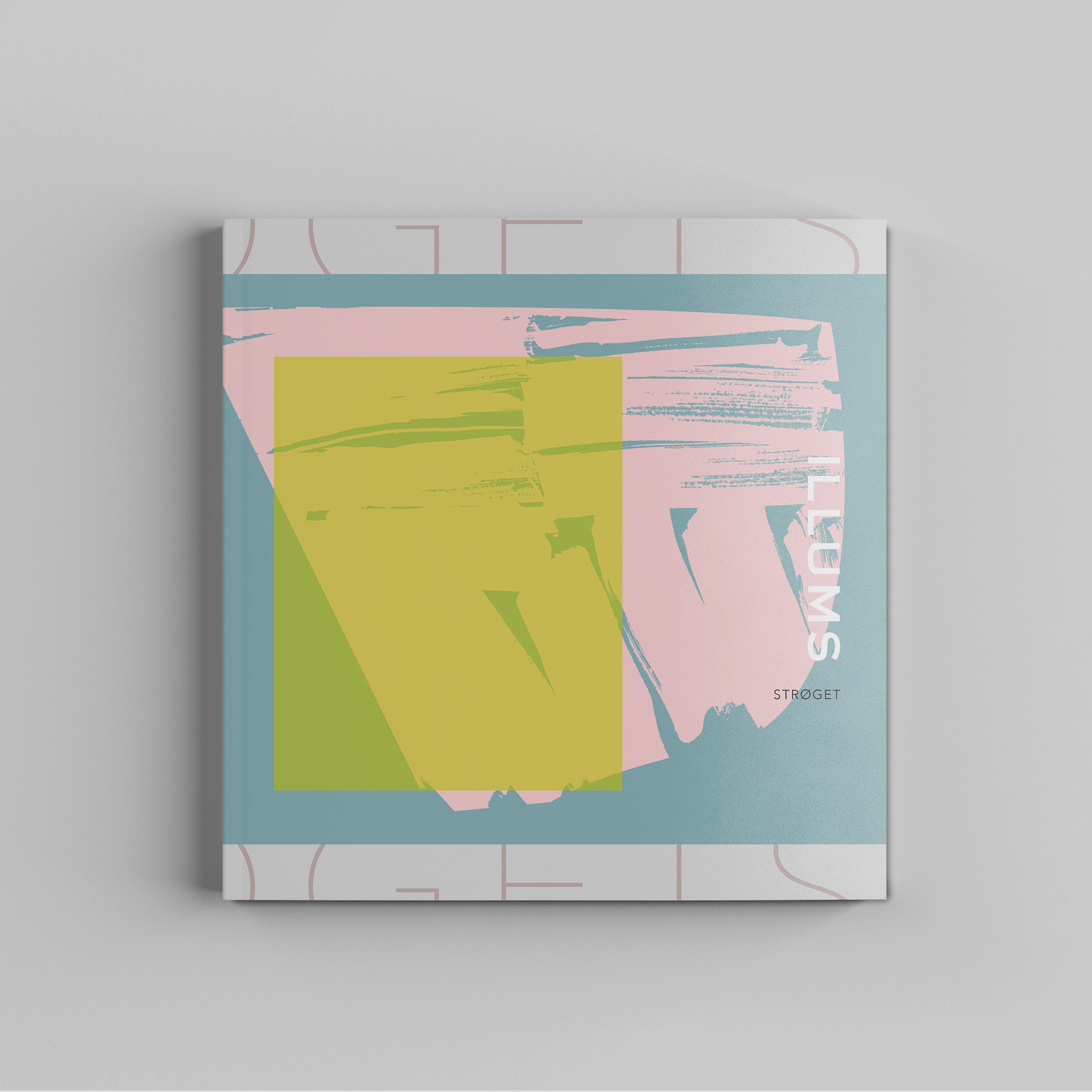
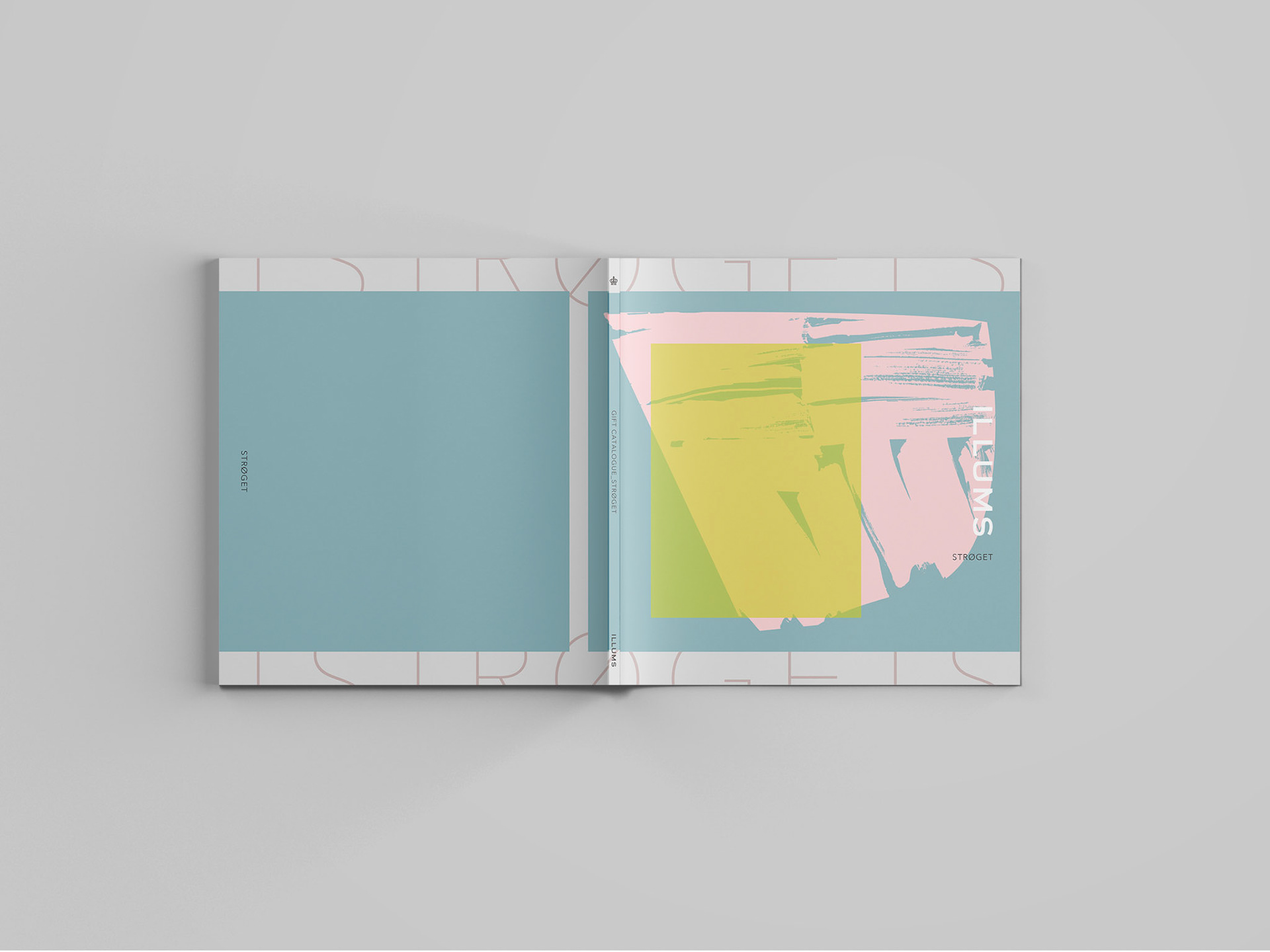
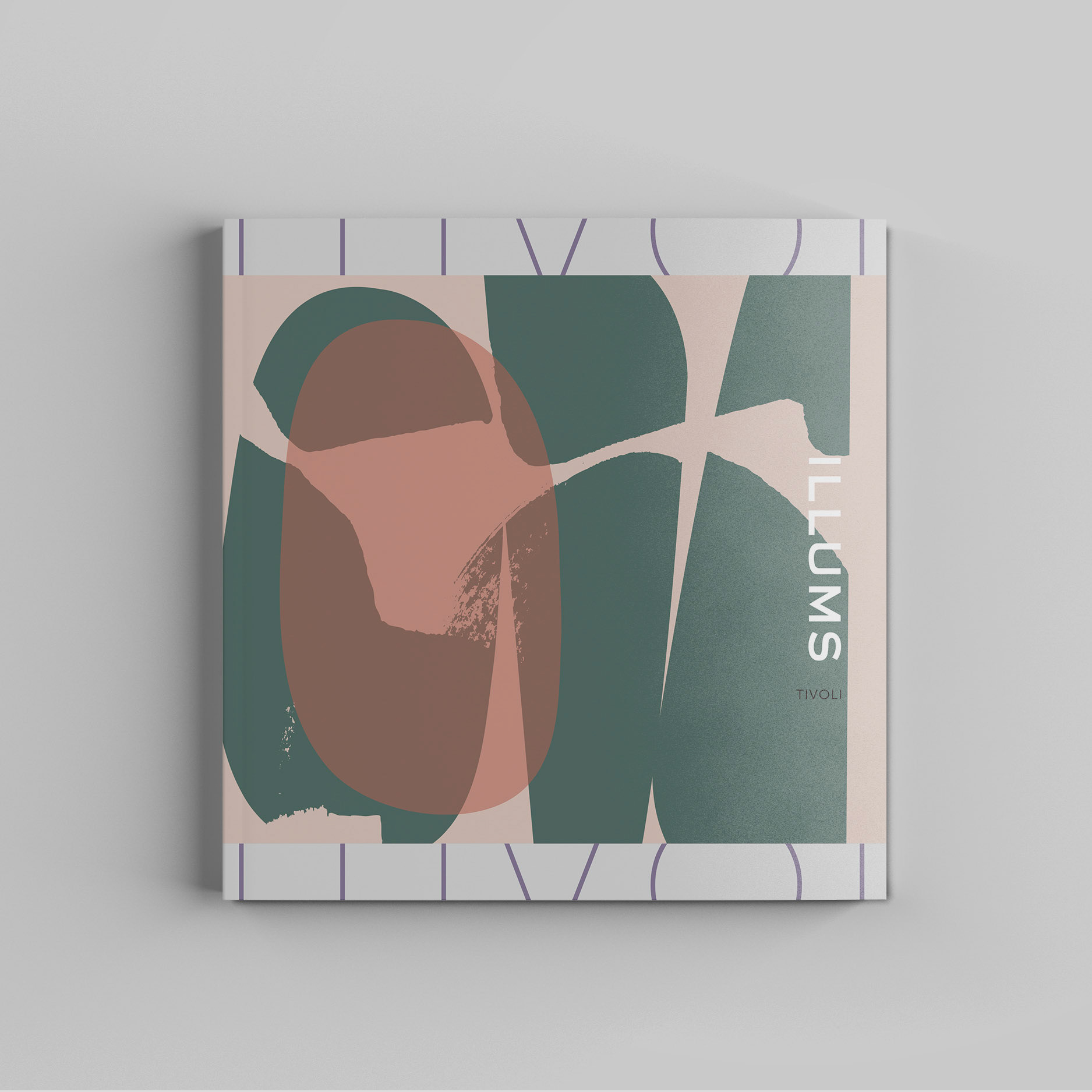
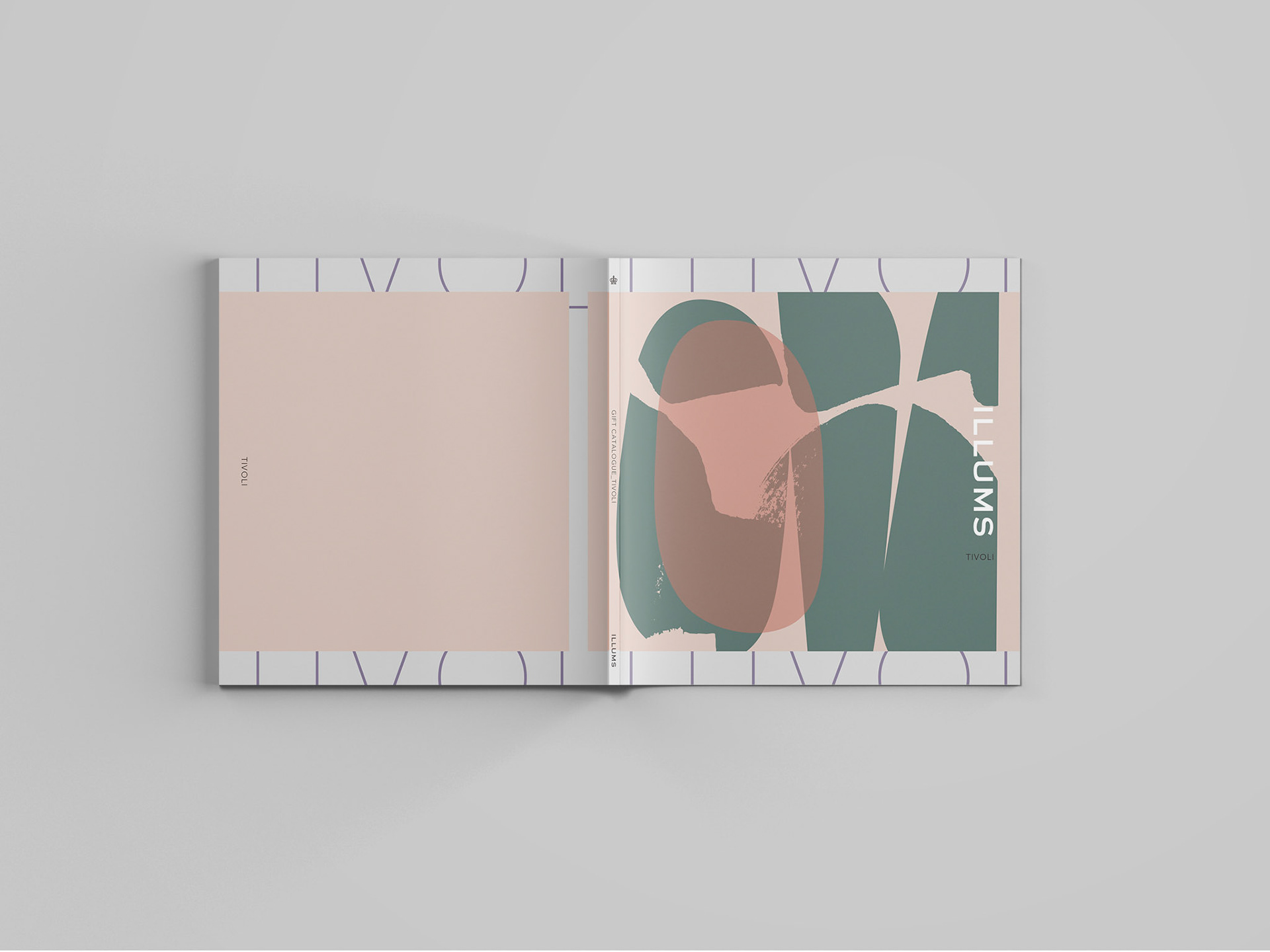
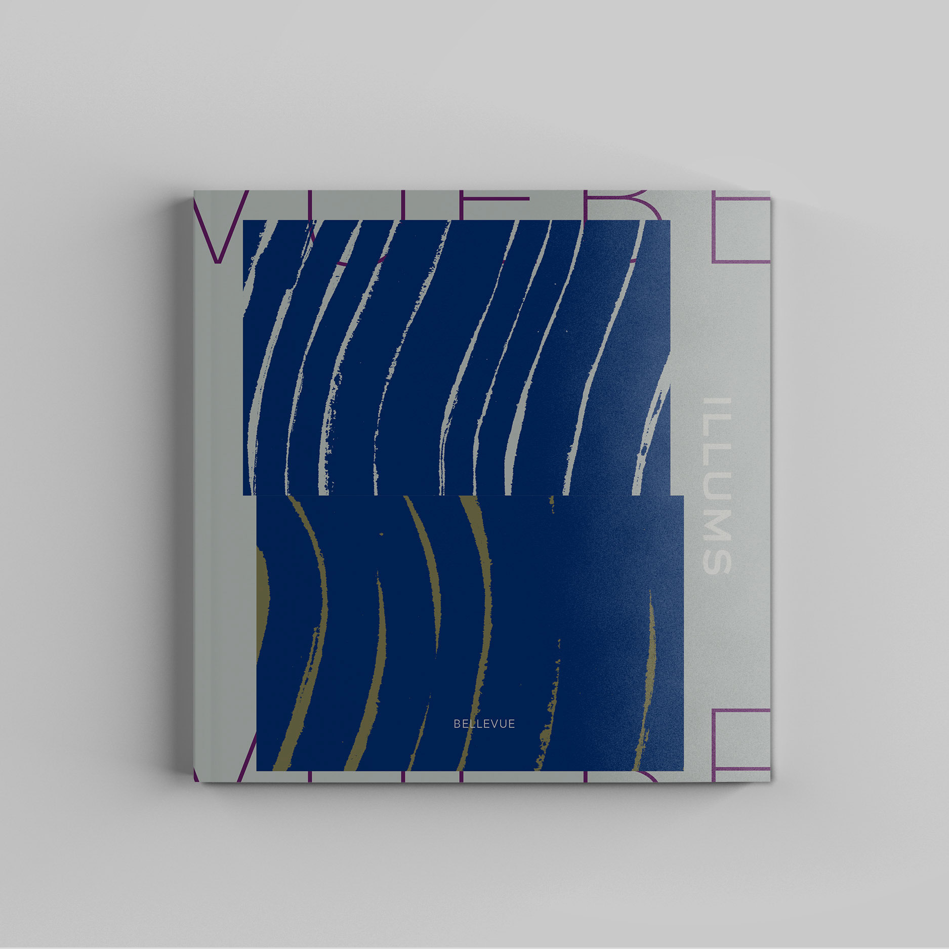
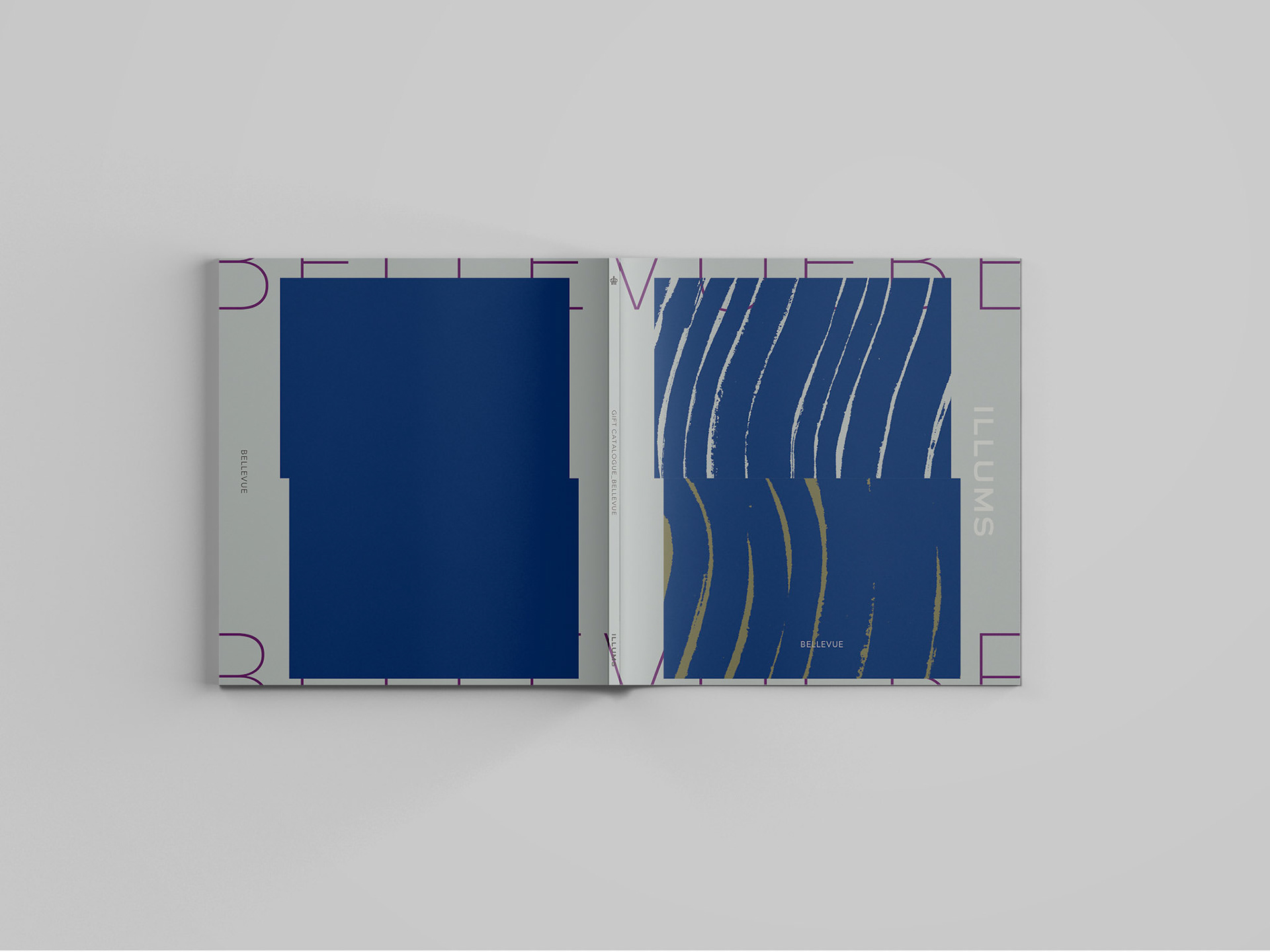
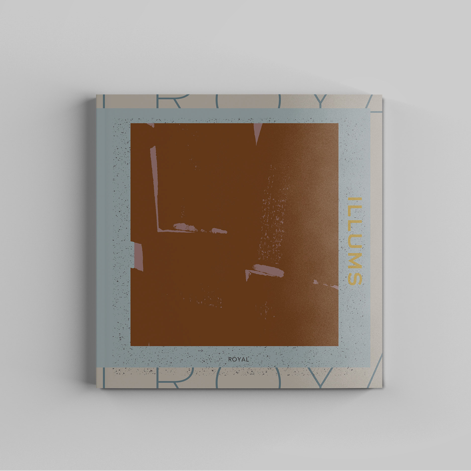
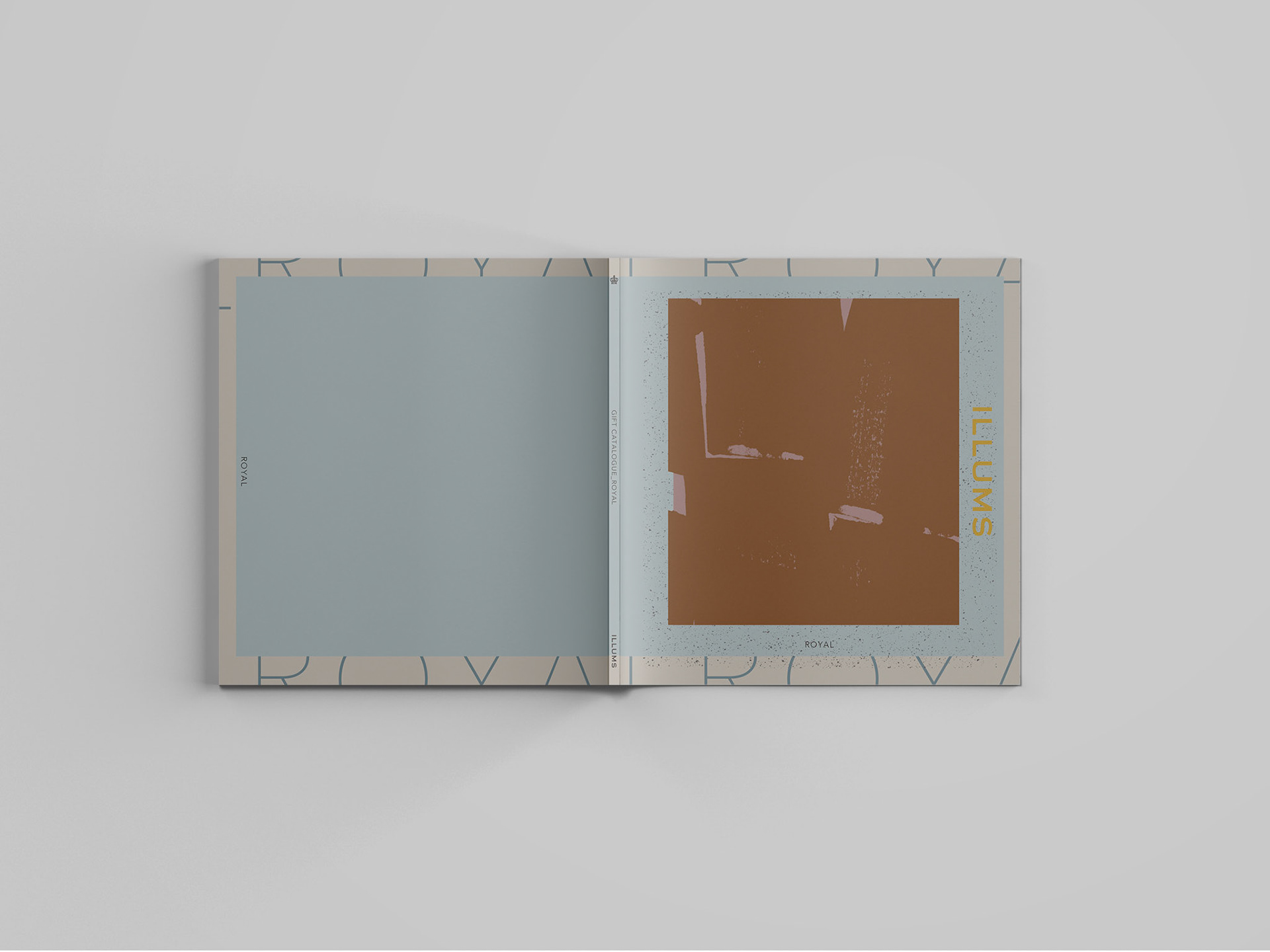
Art Poster on Paper: A Graphic Statement in Everyday Life

北欧色の中に宿る質感と静けさ
Texture and Stillness in Scandinavian Color
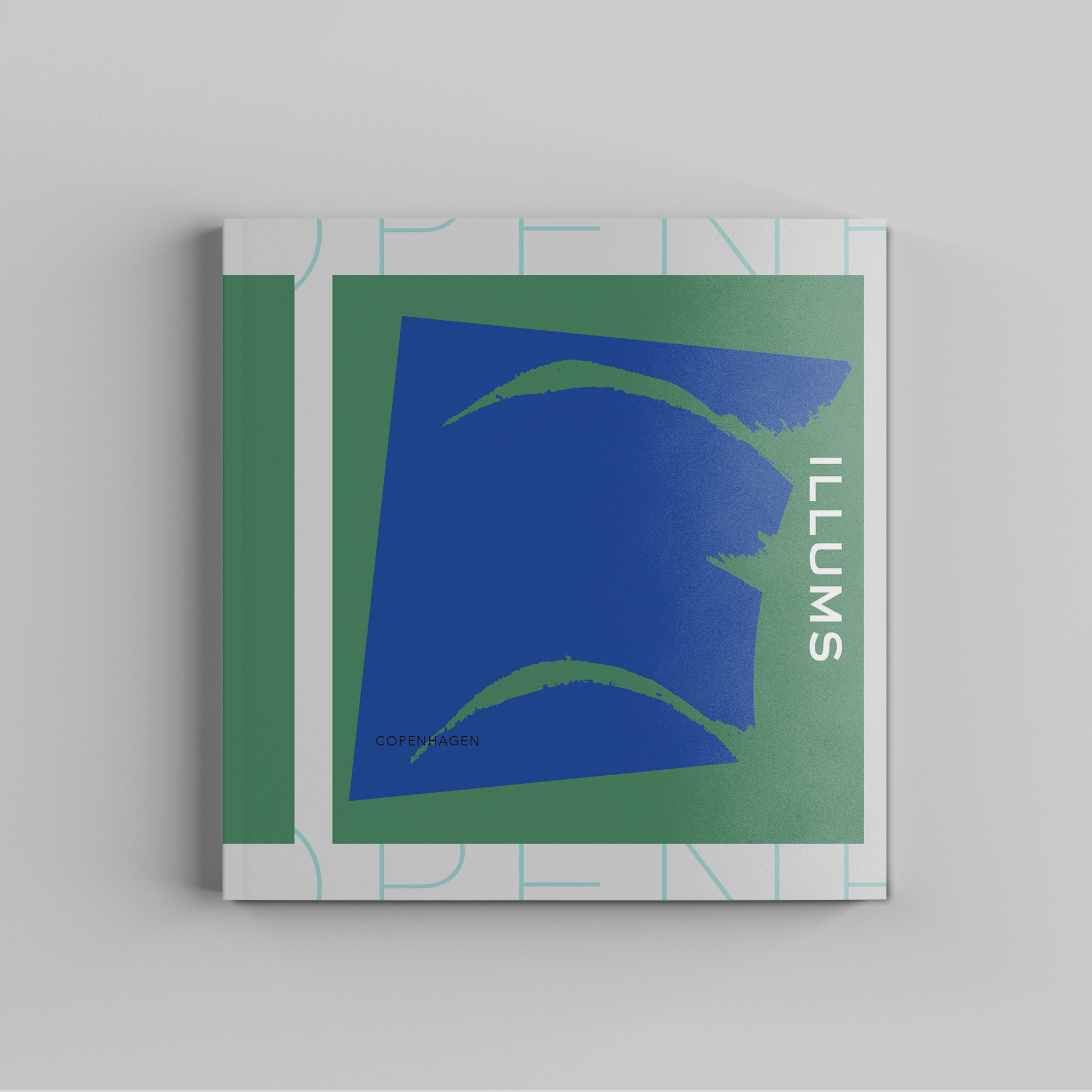
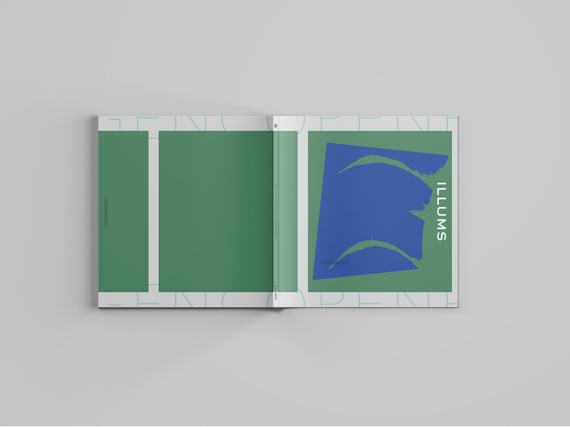
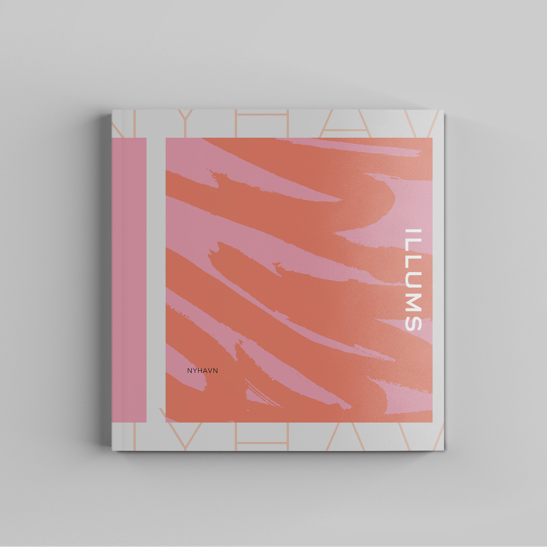
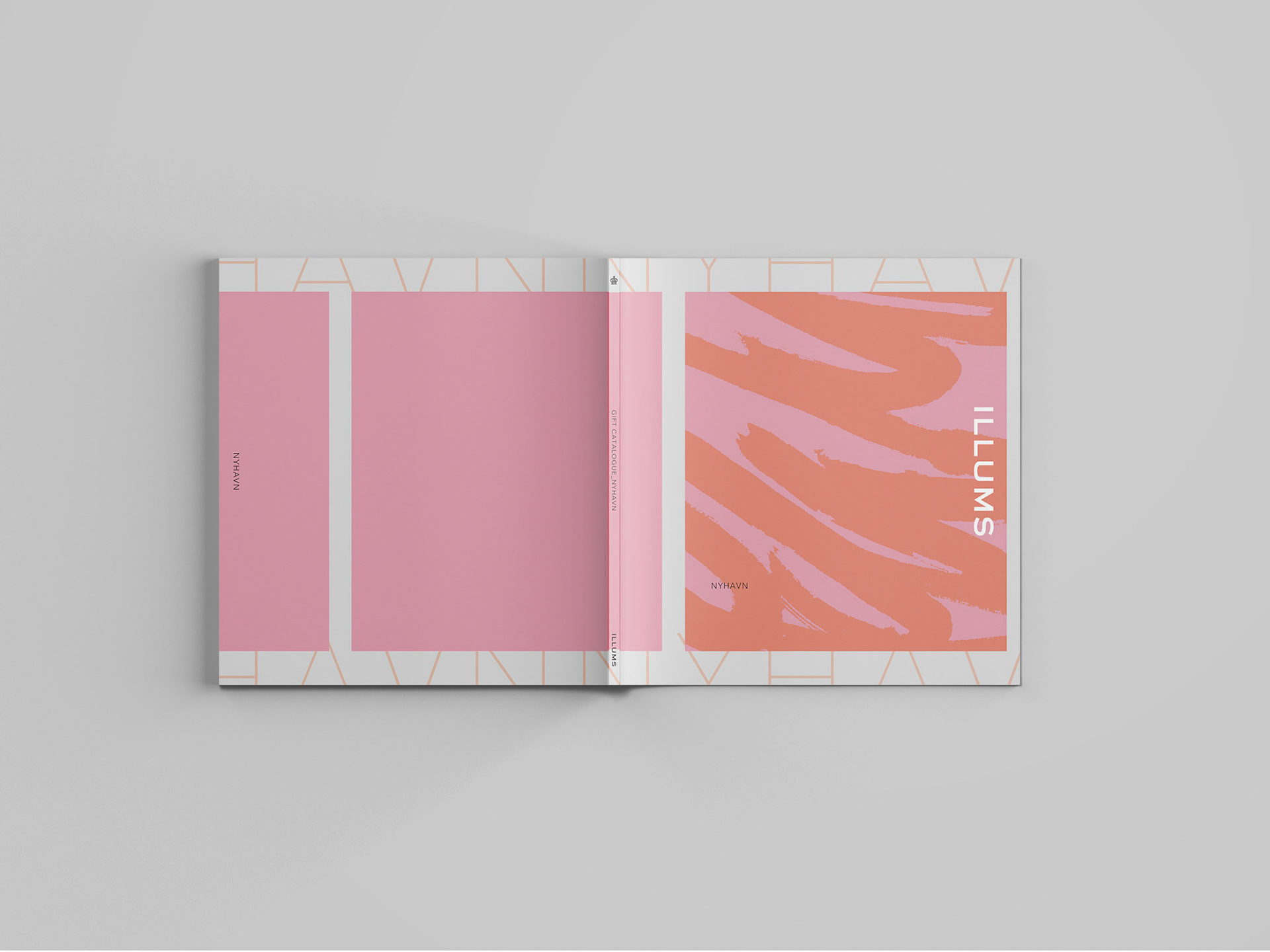
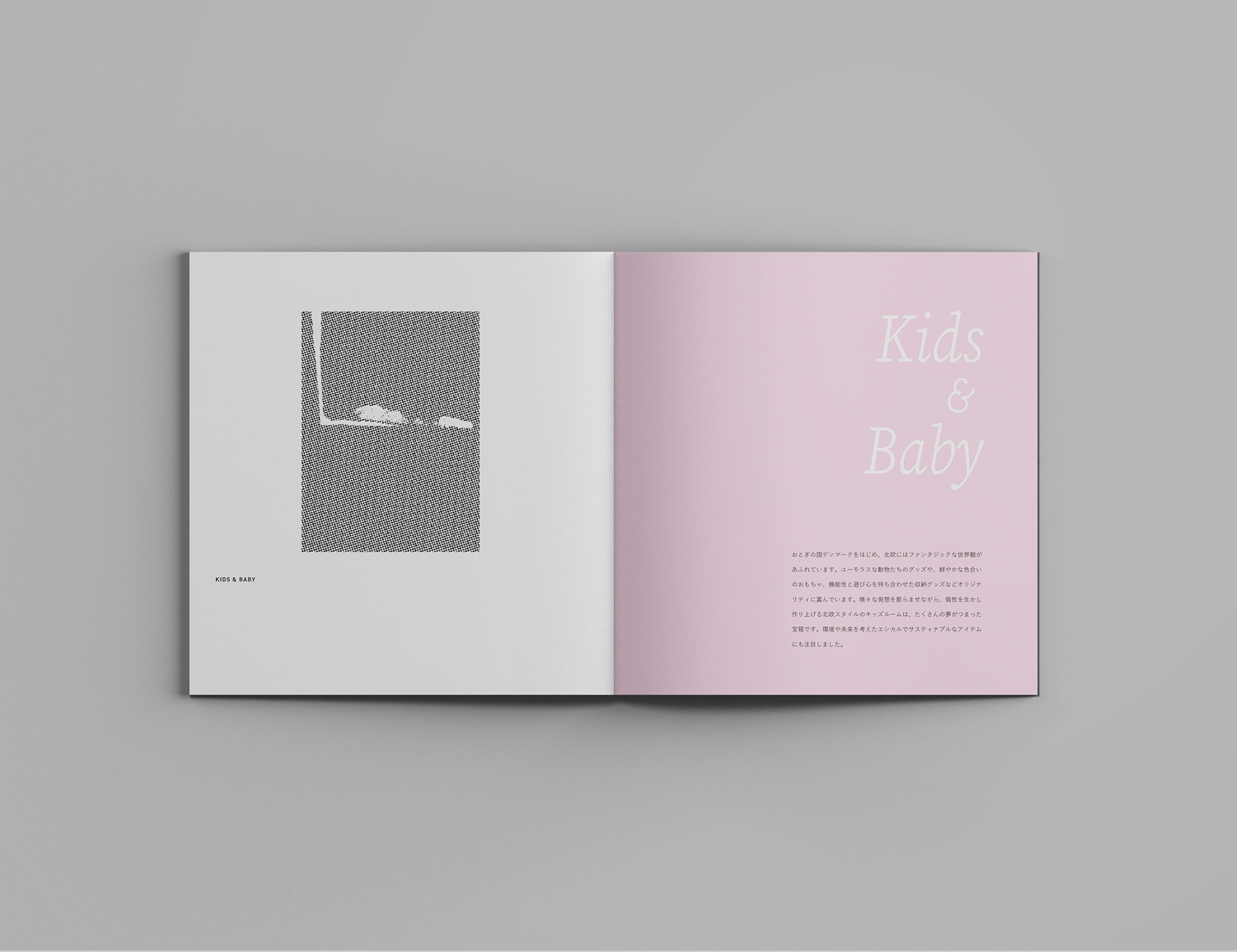
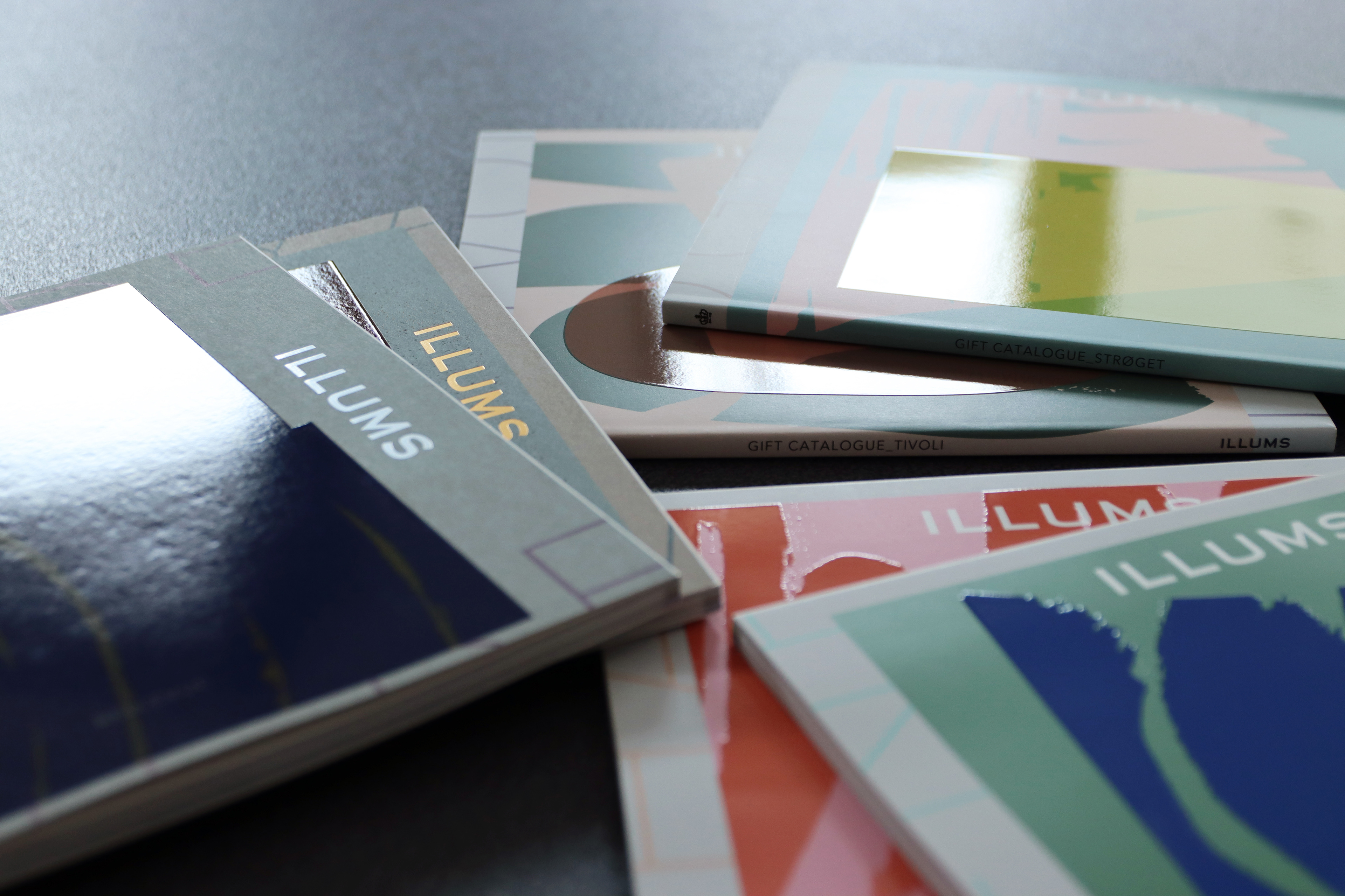
スカンジナビアモダンをコンセプトとするライフスタイル専門店「ILLUMS」のカタログギフトにて、表紙および見出しページのデザインを担当しました。
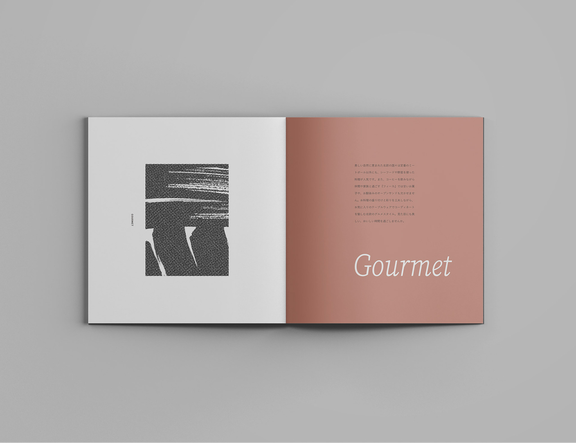
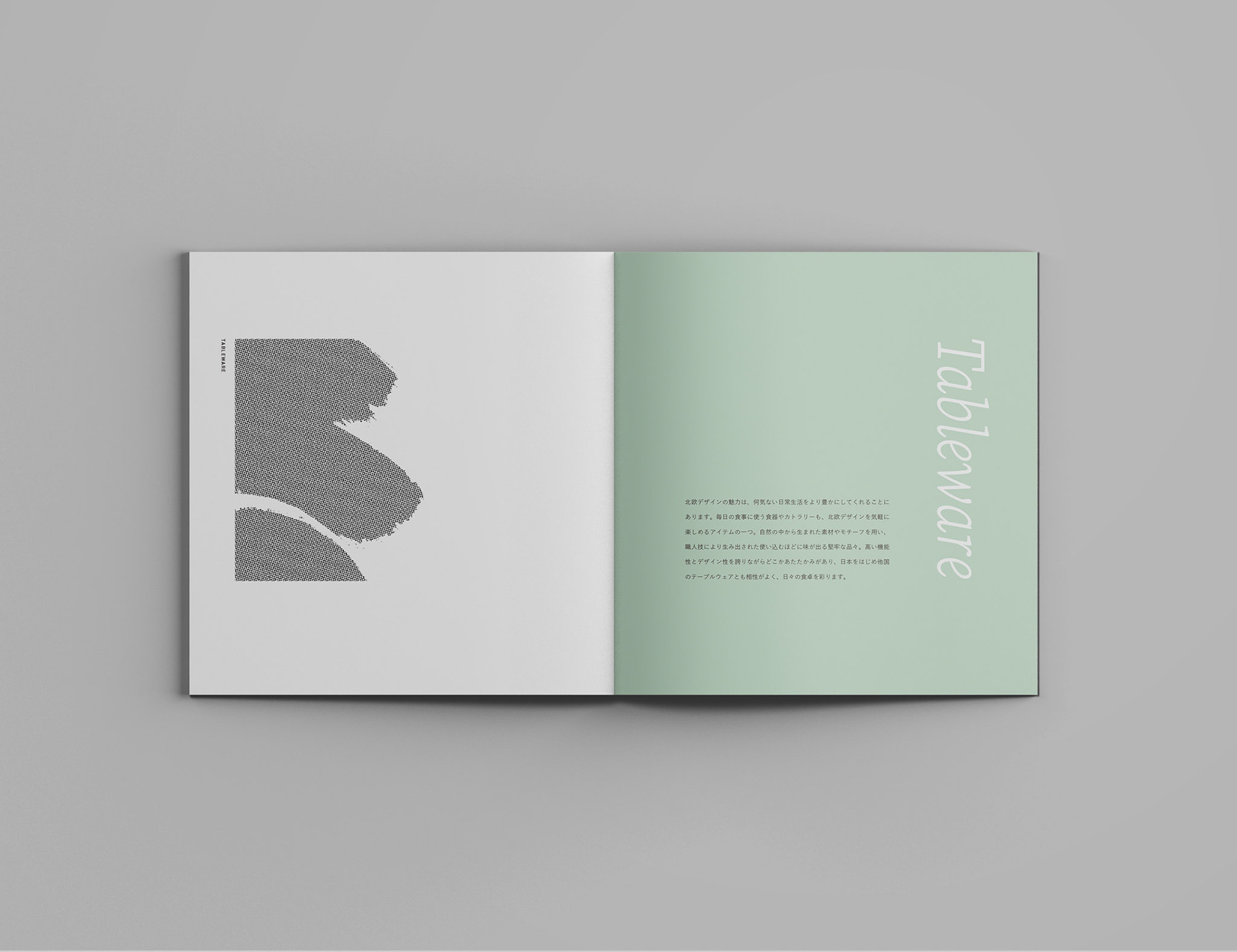
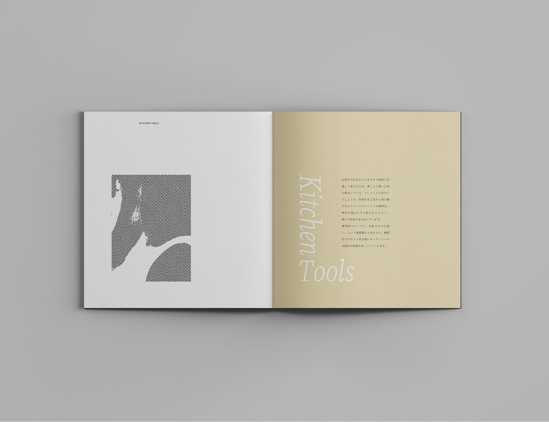
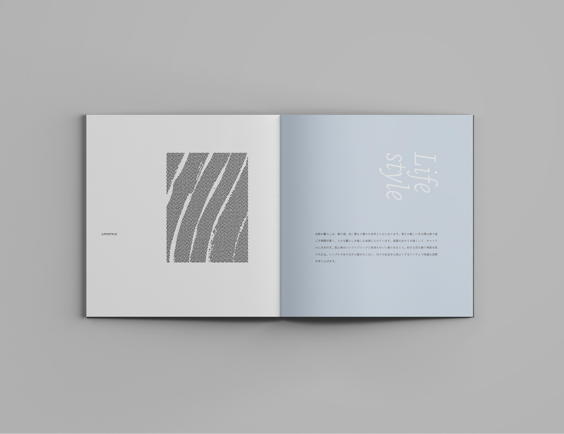
北欧デザインの洗練されたプロダクトが揃う各コースには北欧の都市名が付けられており、それぞれの都市から着想を得たカラーで展開・図案化しています。
表紙には、しなやかで手触りのある質感の異なる2種類の紙を採用し、モチーフの上にはUVニスを部分的に施しました。
素材の選定と加工のバランスにより、視覚と触覚の両面から心地よい印象を与える仕上がりになっています。
抽象的なポスターのような佇まいを意識し、機能性と印象性を両立させたデザインです。
本カタログは、イルムスオンラインストアや、カタログギフト専門店 Yamato などでお求めいただけます。

I was in charge of the cover and section divider page design for the ILLUMS gift catalog, a lifestyle brand based on the concept of Scandinavian modern.
Each course in the catalog features refined Nordic-designed products and is named after a Scandinavian city, with color palettes and patterns inspired by each location.
The cover design uses two types of paper with subtly different textures and finishes, offering a tactile experience.
Spot UV varnish was selectively applied over the graphic elements to create a sense of depth and visual engagement.
With a presence reminiscent of an abstract poster, the design strikes a balance between functionality and artistic expression.
The catalog is available through the ILLUMS online store and at catalog gift specialty shops such as Yamato.
ILLUMS ONLINE STORE https://onlinestore.illums.jp/
静けさの中で設計された
Designed in Silence


6コースのアートワークと呼応するグラフィックを展開。
モノトーンの図案は網点で仕上げ、ページの中で静かに呼吸するようなレイアウトに。
カテゴリー名のページでは、スモーキーな色合いに調和するフォントを合わせました。
余白や間合いを大切に、静けさの中に個性が浮かび上がる構成を意識しています。
Graphic elements were developed in dialogue with the six course artworks.
Monotone visuals rendered in halftone printing are laid out with subtle pacing throughout the pages.
On the category title pages, smoky color tones are paired with carefully selected typefaces.
The design values stillness and space—allowing each element to quietly assert its presence.
本プロジェクトについては、JOURNAL内でも少し触れています。
This project is also briefly featured in the JOURNAL.
Back to Top