
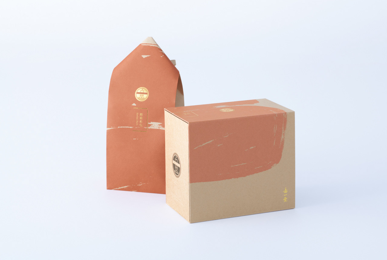
台湾の漢方薬医・意一堂が製造・販売する、妊娠中および出産後のケアのための漢方セットのパッケージデザイン。
前回の真珠粉のパッケージでは、ASENDADA(アセンダダ)のアーカイブデザイン “Fruits” を採用しましたが、本製品では新たにオリジナル図案を描き下ろし、商品特性に寄り添ったビジュアルを提案しています。
また、セット内に封入される小分けパッケージについても、意一堂の既存意匠に準じながら、新パッケージの世界観に合わせてリデザインを実施。
限られた資材内での表現ながら、商品コンセプトを反映したサーフェスデザインとなっています。
This package design was created for a Chinese herbal medicine set developed and sold by I-I TANG, a traditional Chinese medicine clinic in Taiwan, intended for use during and after pregnancy.
While the previous pearl powder package featured ASENDADA’s archive design “Fruits,” this product introduces a newly illustrated, original pattern tailored to the characteristics of the item.
The inner sachets included in the set were also redesigned to align with the new visual direction, while respecting I-I TANG’s existing brand identity. Despite working within the constraints of standard materials, the surface design successfully reflects the product’s overall concept.
このプロジェクトは、ASENDADA(アセンダダ)として取り組んだもので、サトウアサミがパッケージデザインおよびアートディレクションを担当しています。
→ ASENDADAの詳細は 公式サイト にてご覧いただけます。
→ ASENDADAの詳細は 公式サイト にてご覧いただけます。
This project was undertaken as part of ASENDADA, with Asami Sato responsible for the package design and art direction.
→ For more about ASENDADA, please visit the official website.
→ For more about ASENDADA, please visit the official website.